BRAND IDEA FUNDAMENTALS
The Brand Idea system translates Tomorrow’s Timeless into a coherent visual and verbal language across every communication touchpoint. Designed to express the enduring vision of the Sanlorenzo brand, the system defines the principles, tools, and applications that bring the brand idea to life.
Brand Idea Artwork
BLACK VERSION LOGO

WHITE VERSION LOGO

PROTECTION ZONE

MINUM SIZE
Placing Brand Idea Adter Long Copy
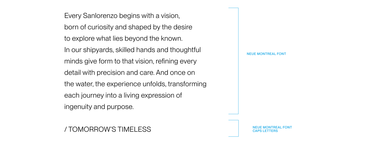
Placing / TOMORROW’S TIMELESS at the end of long copy in an advert.
There are situations when ending a long paragraph with / TOMORROW’S TIMELESS creates a strong link between the sentiment of the copy. It acts as a powerful sign off, to compelling copy. In these situations do not use the / TOMORROW’S TIMELESS artwork asset.
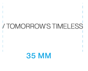
Brand Idea Sizing
Scaling rules between logo and Brand Idea.
The size of / TOMORROW’S TIMELESS is defined in relation to the SANLORENZO logo. In standard formats, the Brand Idea should be proportioned to maintain a balanced visual relationship and preserve hierarchy within the composition. The logo remains the primary brand element and acts as the reference for scaling. / TOMORROW’S TIMELESS should scale proportionally across vertical and horizontal applications while maintaining visual balance with the logo.
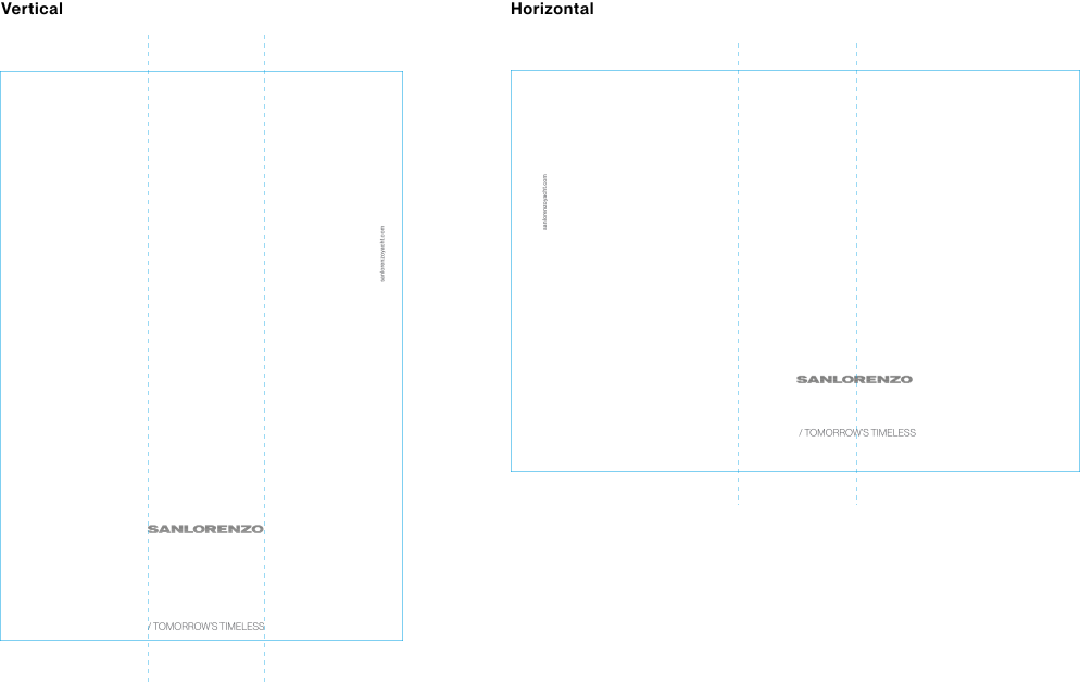
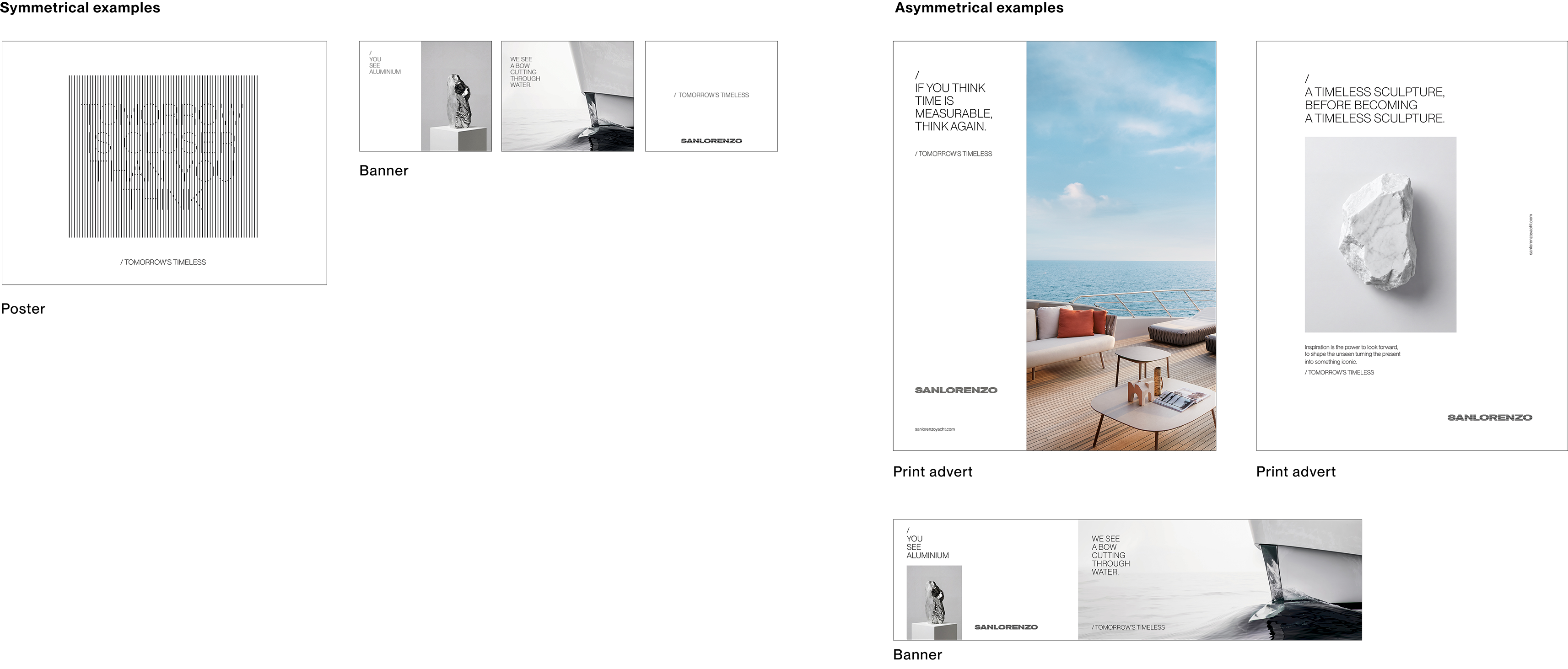
Layout Principles Symmetrical
Logo and Brand Idea Composition.
The symmetrical layout is built around the relationship between the SANLORENZO logo and the Brand Idea / TOMORROW’S TIMELESS. These two elements define the composition and should always be positioned in visual balance to establish a clear and recognisable hierarchy. The logo remains the primary brand element and should be the first visual anchor within the composition. / TOMORROW’S TIMELESS is positioned on the opposite side of the application, creating a symmetrical relationship with the logo.
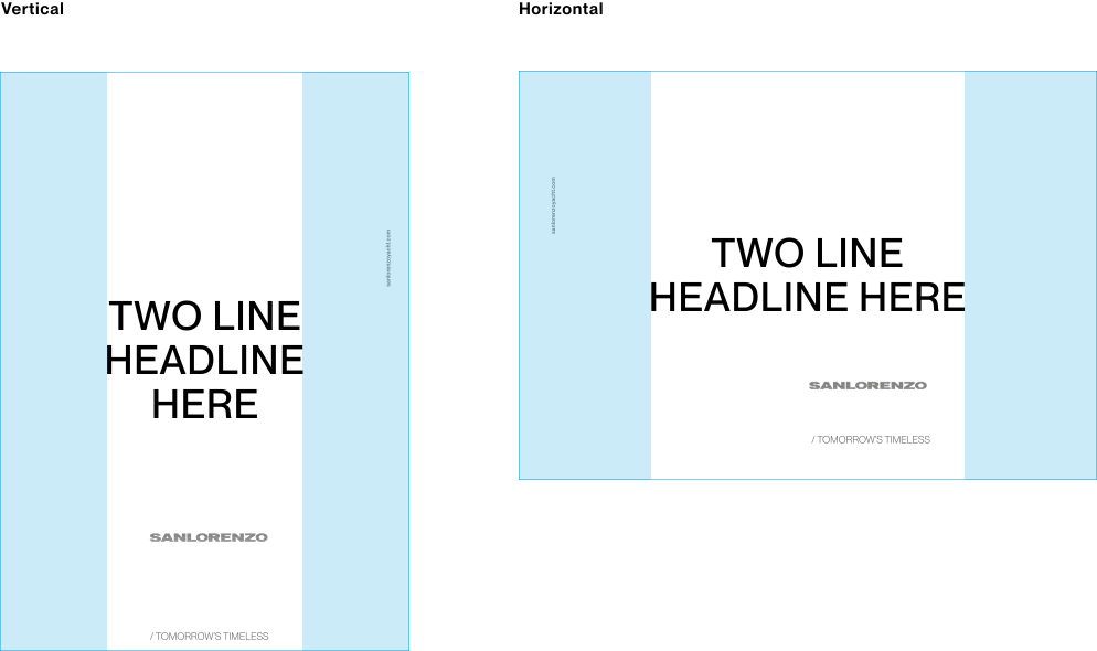
Layout Principles Asymmetrical
A more flexible composition system for content-rich applications.
The asymmetrical layout is used when applications require additional visual elements, longer copy or more articulated compositions. The structure becomes more flexible while maintaining clarity, hierarchy and recognisability. In these applications, the SANLORENZO logo and / TOMORROW’S TIMELESS can move off-centre and adapt to the composition, creating dynamic layouts while preserving the visual identity.

Layout Examples
The visual language is based on two layout principles, symmetrical and asymmetrical.
The Brand Idea visual system is built around two complementary layout approaches: symmetrical and asymmetrical. Each composition responds to different communication needs while maintaining the same visual language, proportions and brand principles. The symmetrical approach conveys balance, clarity and timelessness, while the asymmetrical system introduces a more editorial and narrative expression, ideal for longer copy and storytelling content.