LAYOUT & TEMPLATE
Structure content with clarity and balance using Sanlorenzo's layout system and page templates. Learn how grids, spacing, and predefined templates work together to create elegant, scalable, and consistent digital experiences.
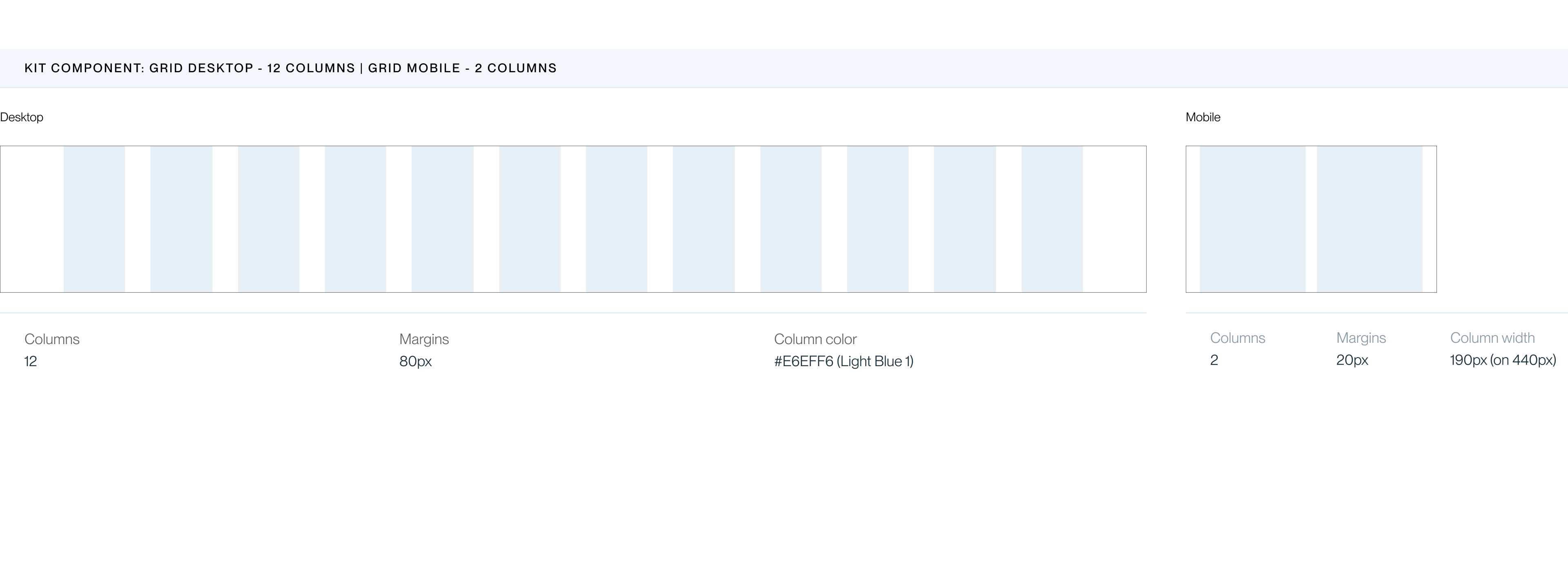
Layout
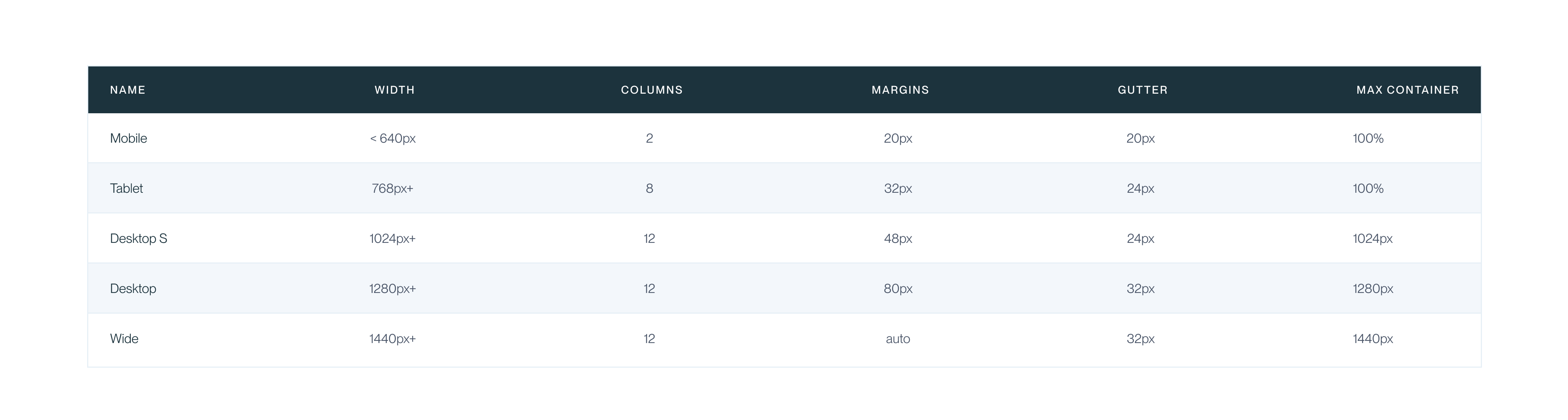
Breakpoints
Container & Sections
Three layout patterns. Full Bleed for images/video. Contained for standard content. Narrow for long-form text.

Primary brand page hosted within the dealer's site. Includes a brand hero banner, a model overview organized by New and Pre-Owned collections, a Manifesto section, a dedicated editorial news area, an Enquire form, and the footer.
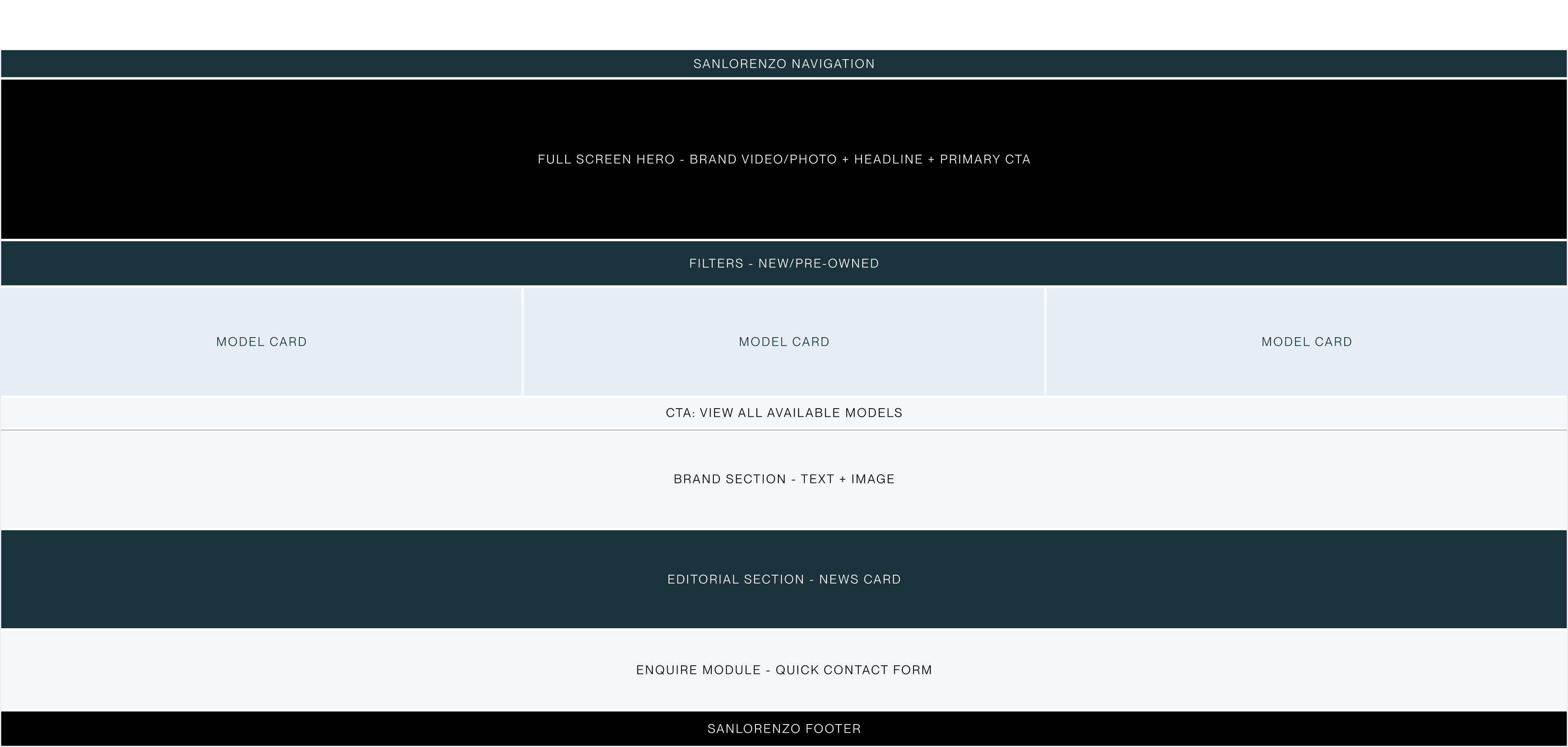
List page
View on FigmaFilterable catalogue of Sanlorenzo models available at the dealer. Filters by line, length, year. Yacht card grid in 3 columns. Pagination with progressive loading.
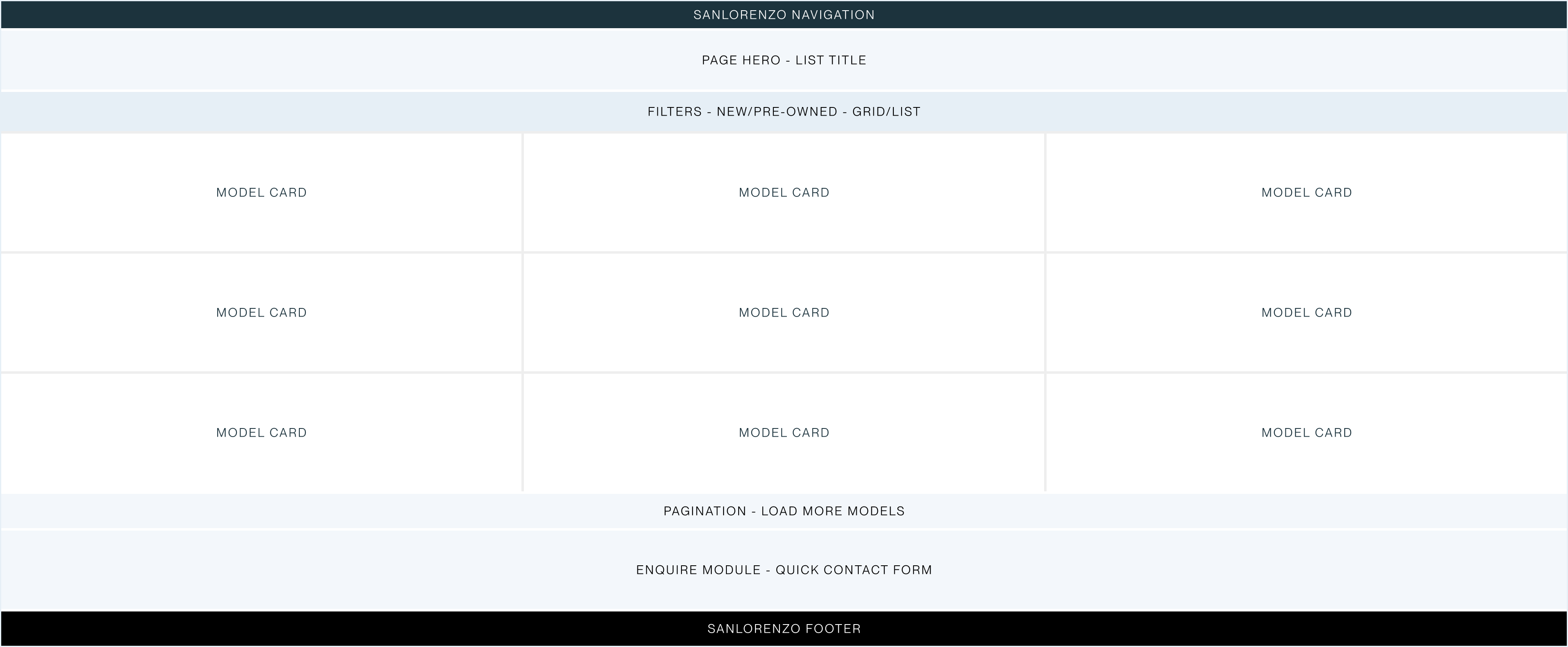
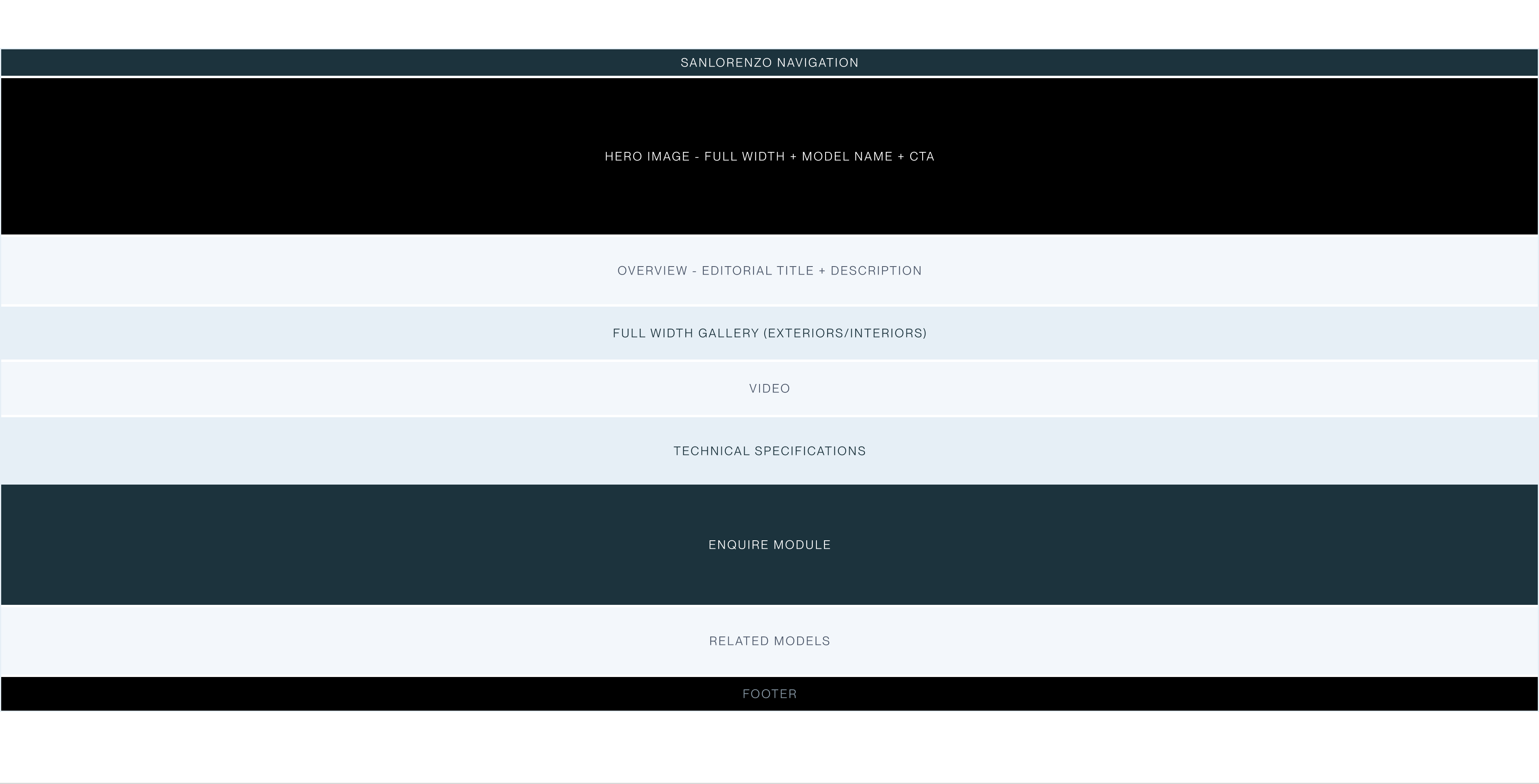
Model detail page
View on FigmaFilterable catalogue of Sanlorenzo models available at the dealer. Filters by line, length, year. Yacht card grid in 3 columns. Pagination with progressive loading.