FOUNDATIONS
Establish a consistent digital presence through Sanlorenzo's visual foundations. Explore brand identity, logo application, color palette, typography, imagery, and the core principles that define every digital experience.
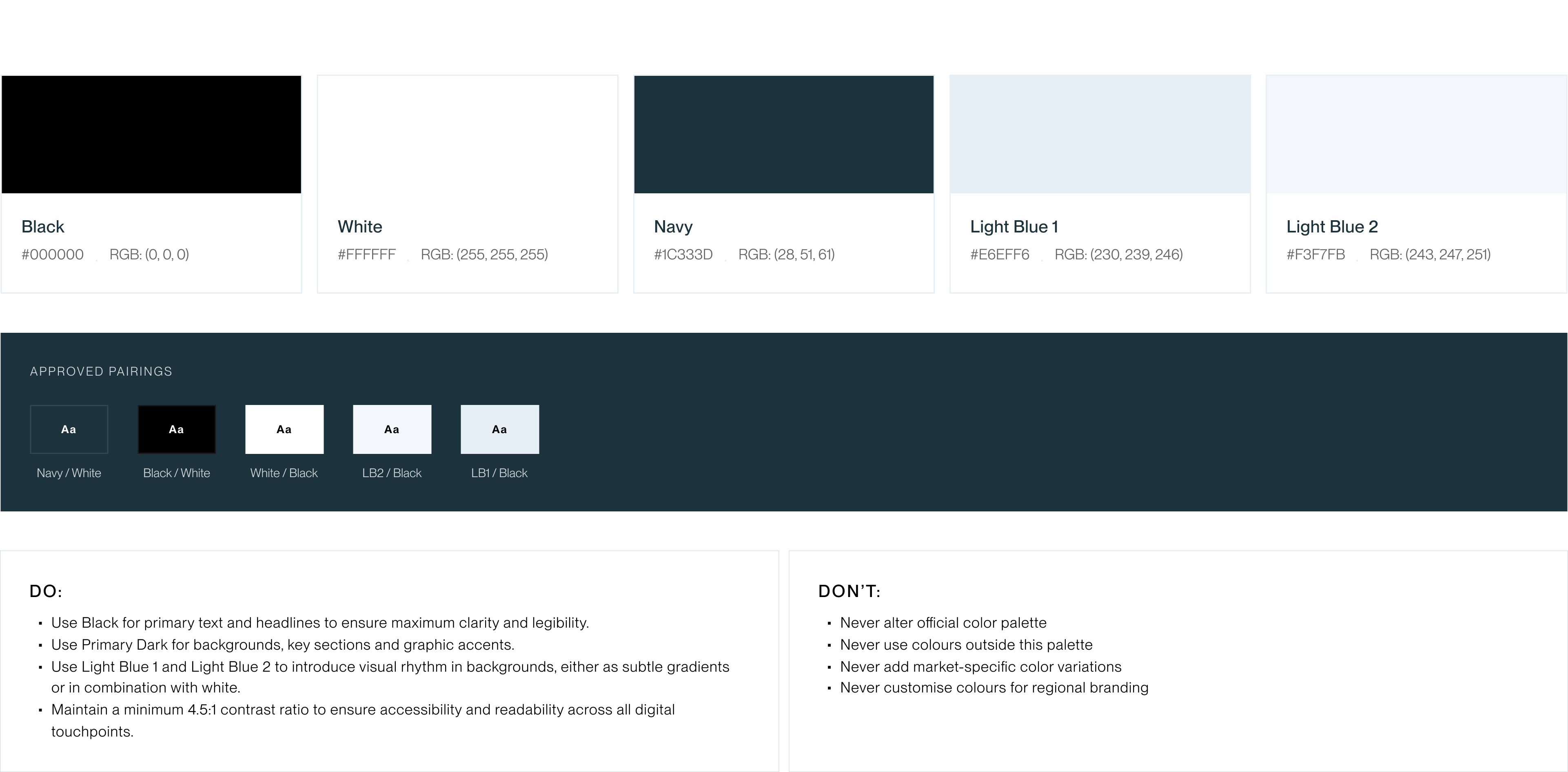
Color Palette
Official Sanlorenzo color system designed for consistency and premium feel across all touchpoints.
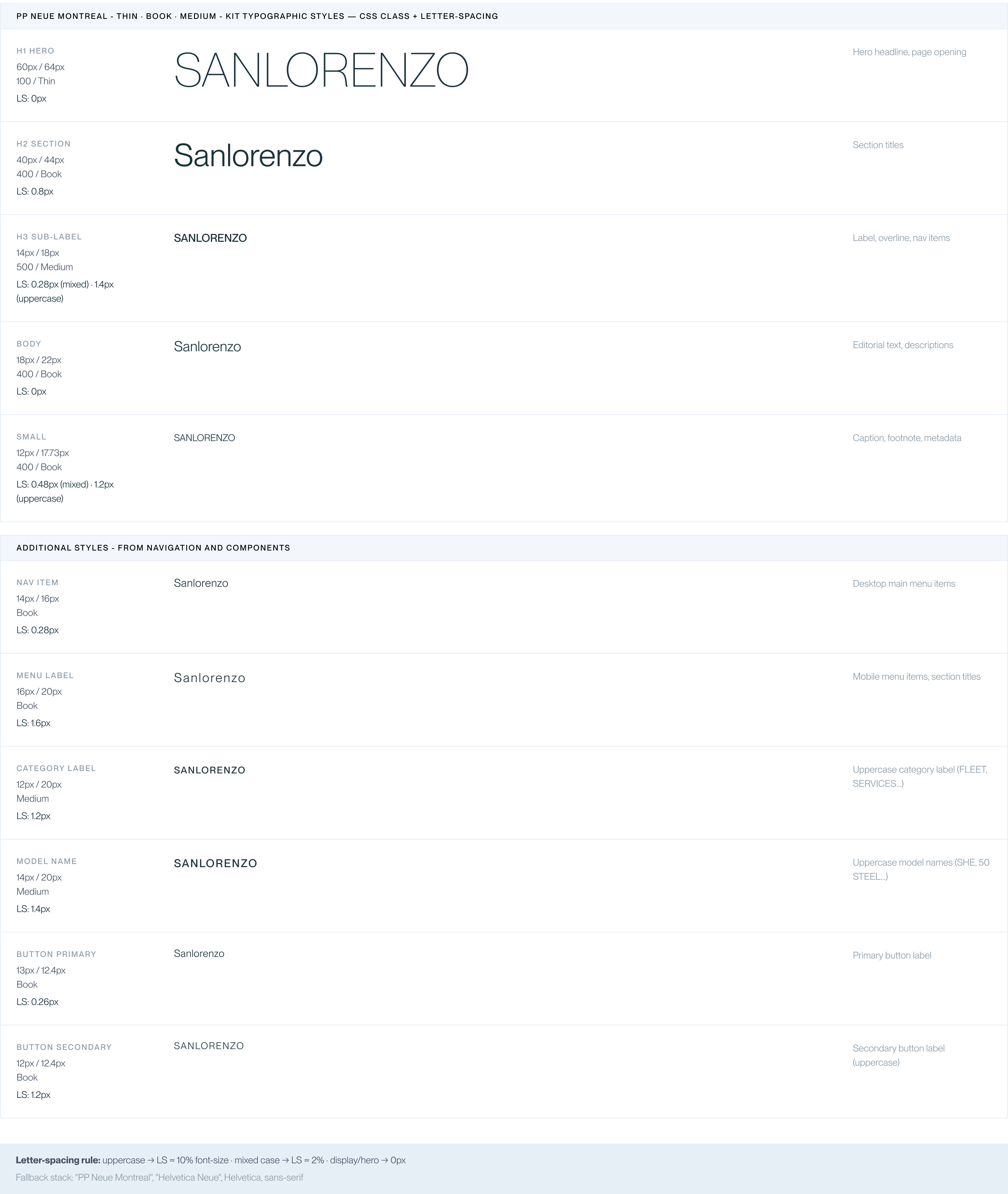
Typography
PP Neue Montreal is Sanlorenzo's exclusive typeface. Geometric, modern - from the lightness of ultra-thin to the rigour of medium.
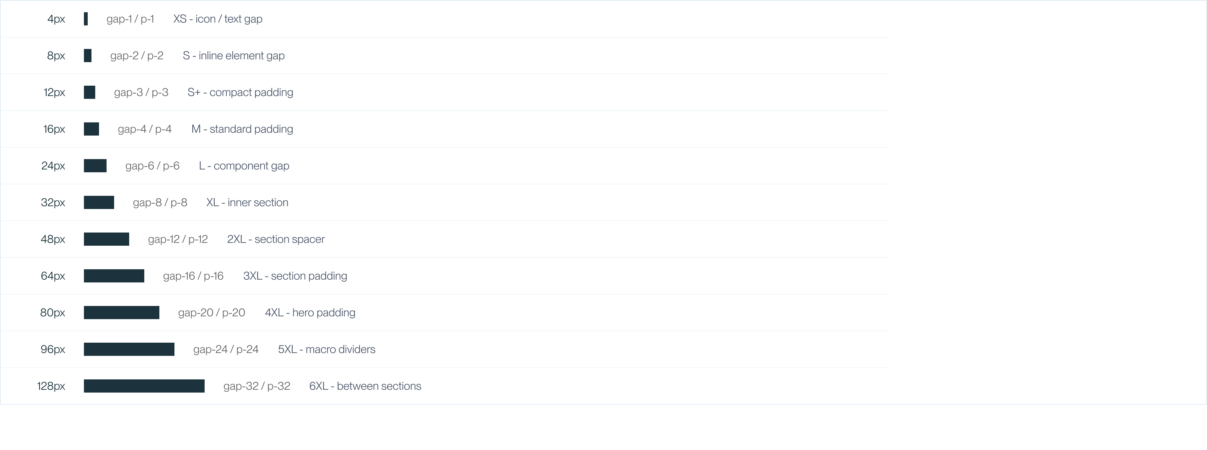
Spacing scale
4px-multiple system. Ensures rhythmic consistency across elements, components and page sections.
Iconography
Linear Material Symbols icons, weight 200 FILL 0. Stroke 1.5px, minimal style. Three sizes: 16px UI - 20px standard - 24px feature.

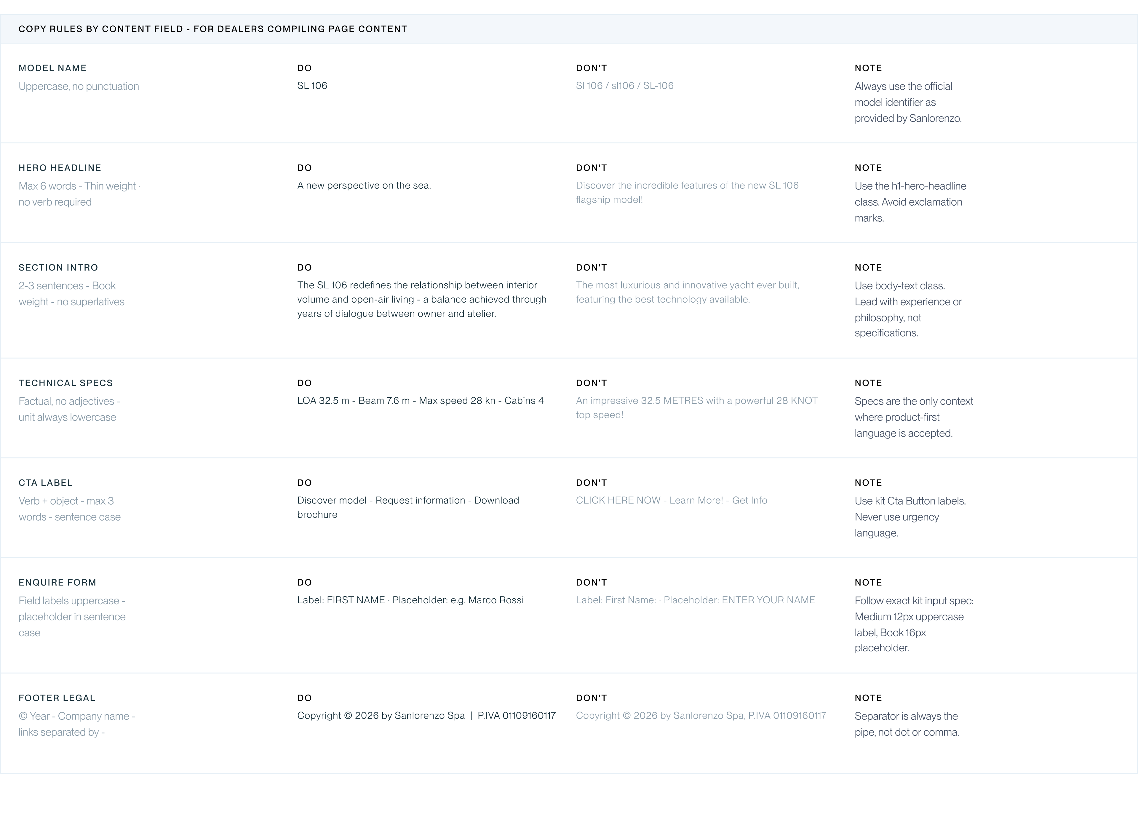
Content writing guidelines
These guidelines translate the Sanlorenzo tone of voice into practical writing rules for each content field. Follow them when creating or adapting page content to ensure consistency across the dealer network.
Images
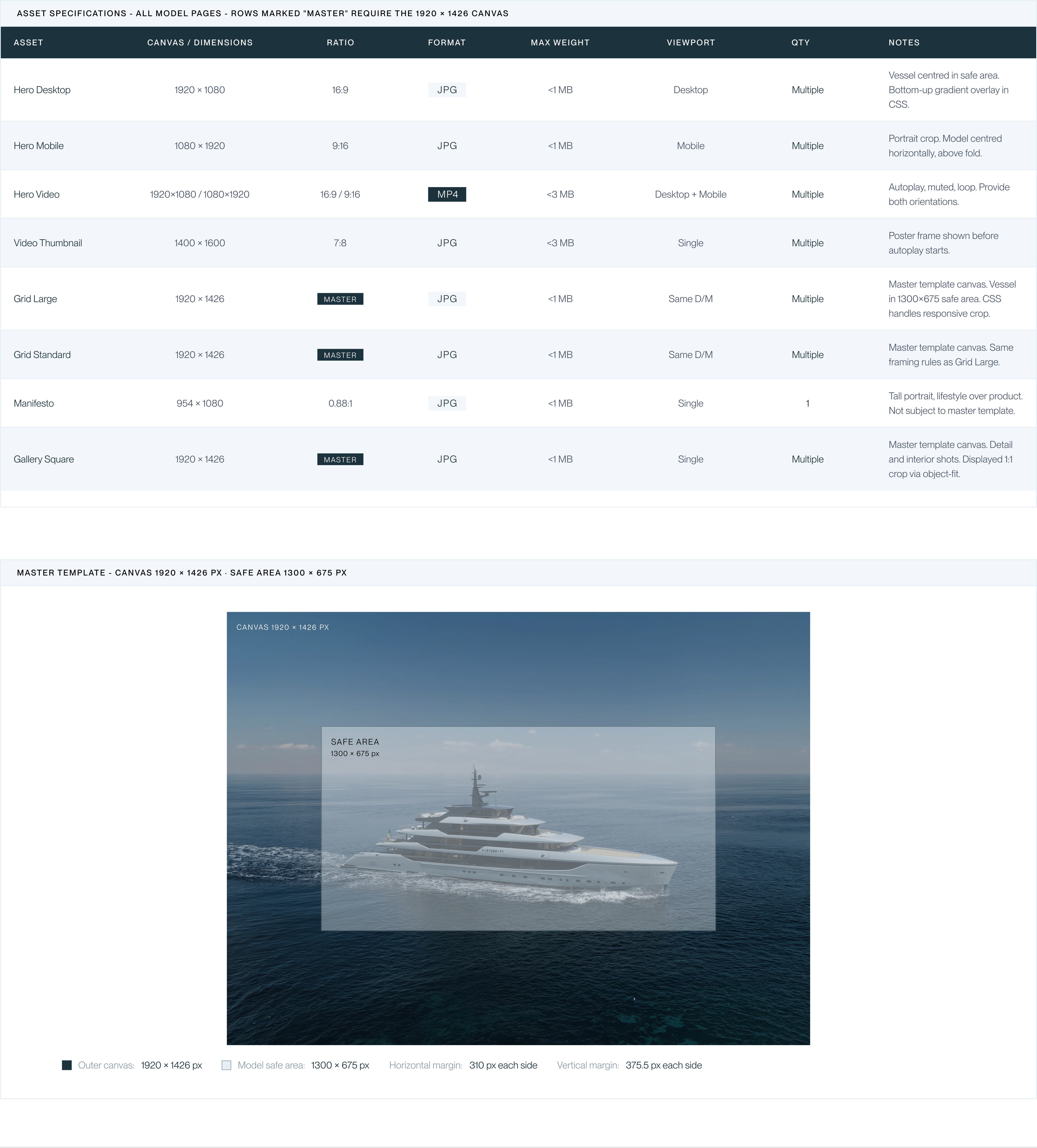
All visual assets must follow the optimization specifications below. Model photography must be prepared using the Master Template to guarantee consistent cropping across responsive breakpoints.